
Learning to use the R Grid Package
I’ve wanted to spend some time to learn how to use the grid graphics pattern for a while. A recent assignment at work gave me the opportunity to do so. I found a great tutorial by Zhou and Braun entitled Fun with the R Grid Package. The grid package allows you to build up a visualization from the ground up. By using viewports, the user can define any piece of the canvas in order to build a small visualization. The power of these visualization comes together when many of these smaller visualizations are put together.
Below is a small example of how this works:
library(grid)
grid.newpage()
grid.rect()

## Create a viewport, rectangle, and text
vp<-viewport(x=0.2,y=0.3,width=0.3,height = 0.1)
pushViewport(vp)
grid.rect(gp=gpar(fill="red",col="black"))
grid.text(as.character("some text"), 0.2, 0.2,gp=gpar(cex=0.9))
popViewport(1)

## Create a viewport, rectangle, and circle
vp<-viewport(x=0.8,y=0.7,width=0.1,height = 0.1)
pushViewport(vp)
grid.rect(gp=gpar(fill="yellow",col="black"))
grid.circle(x=0.7, y=0.3, r=0.2,gp=gpar(fill="red",col="black"))
popViewport(1)

## Create a viewport, rectangle, and line
vp<-viewport(x=0.8,y=0.2,width=0.2,height = 0.2)
pushViewport(vp)
grid.rect(gp=gpar(fill="green",col="black"))
x<-1:4/5; y<-runif(4)
grid.lines(x,y)
popViewport(1)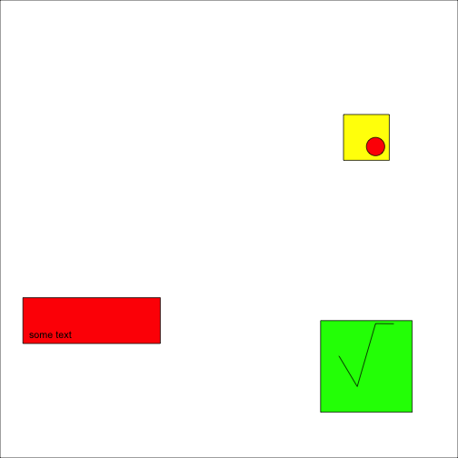
I found that this concept could be very powerful when conducted in a loop. I was trying to create a chart of some data that looked a bit like a periodic table. It wanted the most recent number in the center of each square, with the change from last quarter in the upper right hand quarter, and the last four quarter sparkline at the bottom of the chart. Additionally, the columns would be colored based on a rate, with red being a high rate and green being a low rate. An example of this is given below with randomly generated numbers:
###################################################
library(grid)
a<-matrix(round(runif(100,0,16)),nrow=10)

##Create Color Rank
colfunc<-colorRampPalette(c("red","yellow","springgreen","royalblue"))(n=200)
oldPalette<-palette()
palette(colfunc)

##Start New Grid Page
grid.newpage()
grid.rect()
pushViewport(viewport(width=0.9, height=0.9,
                      xscale=c(0, nrow(a)), yscale=c(0,ncol(a))))
grid.rect()

##Loop over data structure
for(i in 1:nrow(a)){
  for(j in 1:ncol(a)){
  vp<-viewport(x=unit(i-0.5,"native"),y=unit(j-0.5,"native"),
               width=unit(1,"native"),height=unit(1,"native"))
  pushViewport(vp)
  grid.rect(gp=gpar(fill=a[i,j]*10,col="black"))
  grid.text(as.character(a[i,j]), 0.5, 0.5,gp=gpar(cex=1.3))
  grid.text(as.character(a[i,j]), 0.8, 0.85,gp=gpar(cex=0.6))
  vp2<-viewport(x=unit(0.5,"native"),y=unit(0.15,"native"),
           width=unit(0.8,"native"),height=unit(0.3,"native"),xscale=c(1,4),yscale=c(0,1))
  pushViewport(vp2)
  y<-runif(4)
  x<-1:4
  grid.lines(x=unit(x,"native"),y=unit(y,"native"),gp=gpar(col="grey35"))
  grid.points(x=unit(x[4],"native"),y=unit(y[4],"native"),pch=16,gp=gpar(fill="grey35",col="grey35",cex=0.4))
  upViewport()
  upViewport()
}
}
popViewport(1)

pushViewport(viewport(x=0.3,y=0.975,width=0.3,height=0.05))
grid.text("Example Data Table with Grid Package", 0.5, 0.5,gp=gpar(cex=1))
popViewport(1)
The grid package is extremely powerful, especially if you want to tailor a specific visualization for a given problem set.