
Exploring COVID-19 Data
As the COVID-19 virus wreaks havoc across our world, many of us are sitting in our homes trying to figure out if there’s something we can do to help. Many of those with medical skills have already responded to calls for help. Some of us with experience in the data science fields have tried to figure out if there’s something we can do. I am pretty late to the game to work on this, but still wanted to start from scratch. Part of my interest in starting from scratch is that I’ve found that you don’t fully understand a problem unless you really dive in and play with the data. This project gave me the opportunity to to that. If you want to look at some folks that are ahead of me, I recommend this blog post
Data
The two data sources that I’ve set up in my workflows is the data from John Hopkins University (I pull from their Github repository found here). The John Hopkins University repository has been one of the primary source that most of the media use for their official numbers. The JHU data repository is updated daily, and feeds a dashboard found here.
For about a week during the pandemic crisis, JHU’s county data wasn’t as clean and easy to parse. For that reason, I’ve turned to this site for USA county level data. We’ll analyze this source below:
Analyzing National, State, and County trends
Let’s start by computing some of the common trend graphics that are seen in many news articles. For example, at the time that I’m writing this, the New York Times trend analysis can be found at this link.
For my analysis, I will be using the R programming language. Similar
analysis could be done in Python using the Pandas package.
World Trends
We’ll start by analyzing some world trends. To do this we’ll use the JHU
COVID-19 data found on Github. To streamline this process, I’ve cloned
the Github repository and will run a git pull in the terminal before
running the code below. This will ensure that I have the most updated
data.
Now that we have the data, let’s read it in and look at the format.
require(readr)
require(knitr)
df <- read_csv('/Users/dbeskow/Dropbox/CMU/virus/COVID-19/csse_covid_19_data/csse_covid_19_time_series/time_series_covid19_confirmed_global.csv')
kable(head(df[,1:10]))
| Province/State | Country/Region | Lat | Long | 1/22/20 | 1/23/20 | 1/24/20 | 1/25/20 | 1/26/20 | 1/27/20 |
|---|---|---|---|---|---|---|---|---|---|
| NA | Afghanistan | 33.0000 | 65.0000 | 0 | 0 | 0 | 0 | 0 | 0 |
| NA | Albania | 41.1533 | 20.1683 | 0 | 0 | 0 | 0 | 0 | 0 |
| NA | Algeria | 28.0339 | 1.6596 | 0 | 0 | 0 | 0 | 0 | 0 |
| NA | Andorra | 42.5063 | 1.5218 | 0 | 0 | 0 | 0 | 0 | 0 |
| NA | Angola | -11.2027 | 17.8739 | 0 | 0 | 0 | 0 | 0 | 0 |
| NA | Antigua and Barbuda | 17.0608 | -61.7964 | 0 | 0 | 0 | 0 | 0 | 0 |
We see from this messy format that it’s in wide format. In other
words, each day the data curators are adding another columnn of data
with the new statistics for each geographic region. This format makes it
easy to update the data, but hard to analyze in R. Let’s convert it to
long format as well as convert the dates from character type to date
type with the lubridate package:
require(dplyr)
require(tidyr)
require(lubridate)
df_long <- data_long <- gather(df, date, count, 5:ncol(df))
names(df_long) <- c('state', 'country', 'lat', 'lon', 'date', 'count')
df_long$date <- mdy(df_long$date)
kable(head(df_long))
| state | country | lat | lon | date | count |
|---|---|---|---|---|---|
| NA | Afghanistan | 33.0000 | 65.0000 | 2020-01-22 | 0 |
| NA | Albania | 41.1533 | 20.1683 | 2020-01-22 | 0 |
| NA | Algeria | 28.0339 | 1.6596 | 2020-01-22 | 0 |
| NA | Andorra | 42.5063 | 1.5218 | 2020-01-22 | 0 |
| NA | Angola | -11.2027 | 17.8739 | 2020-01-22 | 0 |
| NA | Antigua and Barbuda | 17.0608 | -61.7964 | 2020-01-22 | 0 |
This is much easier to work with.
When we look at the state category, we see that some nations are broken out by state (China, Australia, others), while other nations are left at the national level. In order to compare at the national level, we need to extract the countries that are by state and aggregate the data to a national level. I demonstrate this below
# Separate the data
china <- df_long %>% filter(country == 'China')

# Aggregate to national level
china <- china %>%
  group_by(country,date) %>%
  summarise(count = sum(count)) %>%
  mutate(state = as.character(NA), lat = as.numeric(NA), lon = as.numeric(NA))

# Combine back together
df_long <- df_long %>% bind_rows(china)
Now that we have data at the national level, we can move on to visualization.
For our first visualization, let’s create the common trend map that is found on most news sites. This trend line shows the top countries in the world and plots them on log scale.
require(ggplot2)
require(ggpubr)
s <- df_long %>% group_by(country) %>% summarise(total = sum(count)) %>% top_n(10)
world <- df_long %>% filter(country %in% s$country) %>% filter(count > 100) %>%
  filter(is.na(state)) #%>% filter(date > ymd('20200228'))
ggline(world, x = "date", y = "count",
       color = 'country',
       linetype = 'country',
       yscale = 'log10',
       plot_type = 'l',
       show.line.label = TRUE,
       repel = TRUE,
       legend = 'none')
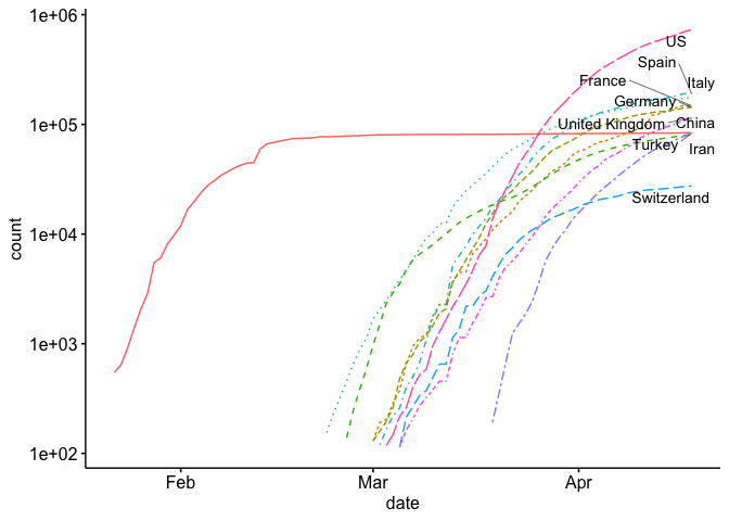
As you can see, it’s a little hard to compare each country because they start at different times. If you look at a similar plot by the New York Times as well as other media, you’ll see that they use days since (n^{th}) case. Let’s see if we can replicate this. As you can see above, we’ve only included counts over 100 in our data. Now we just need to develop a new (x) axis (days since 100th case). I show how to do this below:
library(ggrepel)
min_date <- world %>% group_by(country) %>% summarize(min_date = min(date))
world_adj <- world %>% left_join(min_date) %>% mutate(days_since_100 = date - min_date)
ggline(world_adj, x = "days_since_100", y = "count", color = 'country',
       linetype = 'country',
       yscale = 'log10',
       plot_type = 'l',
       show.line.label = TRUE,
       repel = TRUE)
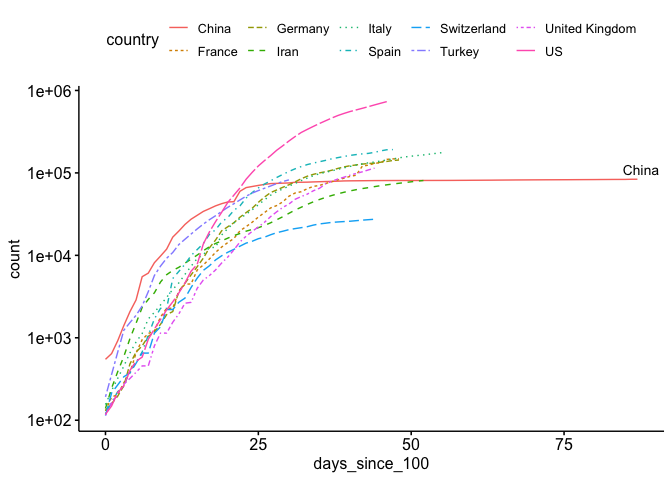
That looks much better.
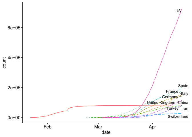
Now our plot, and many of the plots that the news agencies are using, is using a logarithmic scale for the (y) axis. This is helpful for a number of reasons, especially if you want to view exponential growth as a linear line. For example, some news agencies add lines to show the slope at which cases double every 2 days, 3, days, 4 days, etc.
The problem with the log scale is that it can mask the true nature of the exponential growth. Below I plot my first plot, but on a normal scale instead of the exponential scale.
ggline(world, x = "date", y = "count",
       color = 'country',
       linetype = 'country',
       plot_type = 'l',
       show.line.label = TRUE,
       repel = TRUE,
       legend = 'none')
State Level Analysis
Let’s start by getting some data. The code below will download the data found at www.usafacts.org.
download.file('https://usafactsstatic.blob.core.windows.net/public/data/covid-19/covid_confirmed_usafacts.csv', 'covid_confirmed_usafacts.csv')
Now that we have the data, let’s read it in and look at the format:
covid =  read_csv('covid_confirmed_usafacts.csv', col_types = cols(countyFIPS = 'c'))
kable(head(covid[,1:10]))
| countyFIPS | County Name | State | stateFIPS | 1/22/20 | 1/23/20 | 1/24/20 | 1/25/20 | 1/26/20 | 1/27/20 |
|---|---|---|---|---|---|---|---|---|---|
| 0 | Statewide Unallocated | AL | 1 | 0 | 0 | 0 | 0 | 0 | 0 |
| 1001 | Autauga County | AL | 1 | 0 | 0 | 0 | 0 | 0 | 0 |
| 1003 | Baldwin County | AL | 1 | 0 | 0 | 0 | 0 | 0 | 0 |
| 1005 | Barbour County | AL | 1 | 0 | 0 | 0 | 0 | 0 | 0 |
| 1007 | Bibb County | AL | 1 | 0 | 0 | 0 | 0 | 0 | 0 |
| 1009 | Blount County | AL | 1 | 0 | 0 | 0 | 0 | 0 | 0 |
Like the JHU data, this is in wide format and must be converted to long format.
covid_long <- gather(covid, date, count, 5:ncol(covid))
names(covid_long) <- c('fips','county','state','state_fips','date','count')
covid_long$date <- mdy(covid_long$date)
# head(covid_long)
This is much easier to work with.
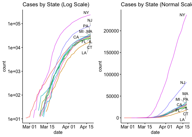
Now let’s look at the top 10 states with side by side plots with normal axis and log-scale axis.
require(gridExtra)
s <- covid_long %>% group_by(state) %>% summarise(total = max(count)) %>% top_n(10)

state_long <- covid_long %>%
  group_by(state,date) %>%
  summarise(count = sum(count)) %>%
  filter(state %in% s$state) %>%
  filter(count > 10)

p1 <- ggline(state_long , x = "date", y = "count", color = 'state',
       yscale = 'log10',
       plot_type = 'l',
       show.line.label = TRUE,
       legend = 'none',
       repel = TRUE) + ggtitle('Cases by State (Log Scale)')

p2 <- ggline(state_long , x = "date", y = "count", color = 'state',
       plot_type = 'l',
       show.line.label = TRUE,
       legend = 'none',
       repel = TRUE) + ggtitle('Cases by State (Normal Scale)')

ggarrange(p1, p2 , nrow = 1, ncol = 2, widths = c(6,6), heights = c(4))
Well, that’s enough for today. In my next blog I’ll try to plot the county level data in a choropleth plot.
Those with experience modeling epidemics have been crutial in helping policy makers. One of the more influential studies among these was performed by the Imperial College and London and can be found here. Many of these models use versions of the SIR (Susceptible, Infected, Recovered) model. SIR models compute the estimated number of infected persons at some time in the future. I’ve studied System Dynamics as well as Agent Based SIR models during my time here at CMU. However, I’ve used them to map disinformation rather than a virus (see our agent based paper here).