
COVID-19 Heat Map
A week or so ago I shared a blog demonstrating how to download reputable COVID-19 data and generate temporal Coronavirus case count plots like the ones seen in top news sites such as the New York Times or Wall Street Journal. This week I will walk through how to use that same data from last week and the R programming language to generate a choropleth plot by county in the United States.
The plots that I will generate are all static plots. If you want to see an interactive example, I would refer you to a great tool that Ian Kloo created at https://iankloo.github.io/cov_map/.
The final product we’re shooting for is shown below. Let’s dive into the steps to get there.
National Level Choropleth Maps
Let’s start by getting the same county level data we downloaded in the last post.
require(ggplot2)
require(readr)
require(dplyr)
require(tidyr)
require(lubridate)
require(knitr)

download.file('https://usafactsstatic.blob.core.windows.net/public/data/covid-19/covid_confirmed_usafacts.csv', 'covid_confirmed_usafacts.csv')
Now let’s convert it from wide to long format.
county =  read_csv('covid_confirmed_usafacts.csv', col_types = cols(countyFIPS = 'c'))
county_long <- gather(county, date, count, 5:ncol(county))
names(county_long) <- c('fips','county','state','state_fips','date','count')
county_long$date <- mdy(county_long$date)
kable(head(county_long))
| fips | county | state | state_fips | date | count |
|---|---|---|---|---|---|
| 0 | Statewide Unallocated | AL | 1 | 2020-01-22 | 0 |
| 1001 | Autauga County | AL | 1 | 2020-01-22 | 0 |
| 1003 | Baldwin County | AL | 1 | 2020-01-22 | 0 |
| 1005 | Barbour County | AL | 1 | 2020-01-22 | 0 |
| 1007 | Bibb County | AL | 1 | 2020-01-22 | 0 |
| 1009 | Blount County | AL | 1 | 2020-01-22 | 0 |
Now we’ll summarize all counts by county. The only data we won’t count is counts that are labeled Statewide Unallocated. This is presumably state level counts that were never attributed to a distinct county.
cty <- county_long %>%
  group_by(fips, county, state, county) %>%
  summarize(count = max(count)) %>%
  filter(count > 0) %>%
  filter(county != 'Statewide Unallocated')
Looking at the data, we will see that R cut off some of the FIPS code leading zeros. The code below will concatenate a leading ‘0’ to the front of any FIPS code with only 4 digits.
x <- nchar(cty$fips)
cty$fips[x == 4] <- paste0('0',cty$fips[x == 4] )
kable(head(cty))
| fips | county | state | count |
|---|---|---|---|
| 1 | New York City Unallocated/Probable | NY | 119 |
| 10001 | Kent County | DE | 793 |
| 10003 | New Castle County | DE | 1864 |
| 10005 | Sussex County | DE | 2359 |
| 01001 | Autauga County | AL | 45 |
| 01003 | Baldwin County | AL | 181 |
The usmap library in R provides a great resource for easily merging
and visualizing county and state level data. The simplicity of this is
demonstrated in the single line of code below:
library(usmap)

df <- countypop %>% dplyr::left_join(cty, by = 'fips')
kable(head(df))
| fips | abbr | county.x | pop_2015 | county.y | state | count |
|---|---|---|---|---|---|---|
| 01001 | AL | Autauga County | 55347 | Autauga County | AL | 45 |
| 01003 | AL | Baldwin County | 203709 | Baldwin County | AL | 181 |
| 01005 | AL | Barbour County | 26489 | Barbour County | AL | 43 |
| 01007 | AL | Bibb County | 22583 | Bibb County | AL | 42 |
| 01009 | AL | Blount County | 57673 | Blount County | AL | 40 |
| 01011 | AL | Bullock County | 10696 | Bullock County | AL | 14 |
Now we’ll visualize the lower 48 states as a county level choropleth plot:
plot_usmap(data = df, values = "count", color = 'white') +
  scale_fill_continuous(
    low = "orange", high = "red", name = "Count", label = scales::comma) +
  theme(legend.position = "right",panel.background = element_rect(fill = "black",
                                                                 colour = "black",
                                                                 size = 0.5, linetype = "solid")) +
  ggtitle('Number of Confirmed COVID-19 Cases by County')
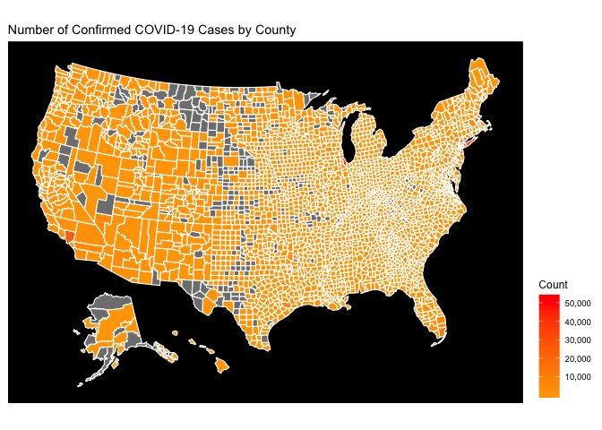
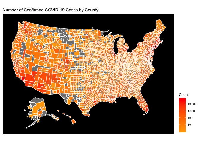
This map is hard to decipher because the magnitude of the COVID-19 epidemic in the greater New York City area simply dwarfs everything else. On the Choropleth map, this means that NYC is red, and everything else is simply orange. The easiest way to fix this is to use a type of logarithmic scale for the coloration. This is done below:
my_breaks = c(0, 10, 100, 1000, 10000, 100000)
plot_usmap(data = df, values = "count", color = 'white') +
  scale_fill_continuous(
    low = "orange", high = "red", name = "Count", trans = "log", breaks = my_breaks, label = scales::comma) +
  theme(legend.position = "right",panel.background = element_rect(fill = "black",
                                                                 colour = "black",
                                                                 size = 0.5, linetype = "solid")) +
  ggtitle('Number of Confirmed COVID-19 Cases by County')
The choropleth on a logarithmic gradient scale reveals the regional hotspots that were originally hidden by the national hotspots.
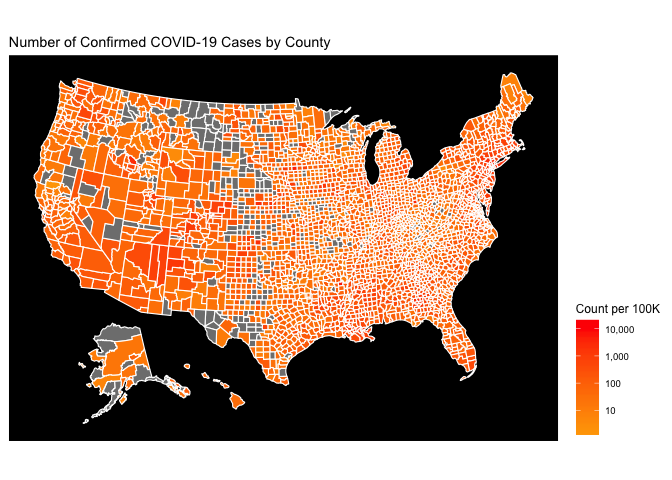
Finally, I’d like to highlight that most choropleths are statistically deceiving, given that most choropleth maps (including these) are comparing geography representing vastly different areas and populations. One way to fix this is to use arbitrary square geometry of equal size instead of the current county geometry. Another way to fix this is to simply normalize our county level data by the county population. The hotspots on the new map are the areas that have a high COVID-19 Case count relative to their population. The count metric in this case is count per 100,000 people
df$count_per_100K <- 100000 * df$count/df$pop_2015

my_breaks = c(0, 10, 100, 1000, 10000, 100000)
plot_usmap(data = df, values = "count_per_100K", color = 'white') +
  scale_fill_continuous(
    low = "orange", high = "red", name = "Count per 100K", trans = "log", breaks = my_breaks, label = scales::comma) +
  theme(legend.position = "right",panel.background = element_rect(fill = "black",
                                                                 colour = "black",
                                                                 size = 0.5, linetype = "solid")) +
  ggtitle('Number of Confirmed COVID-19 Cases by County')
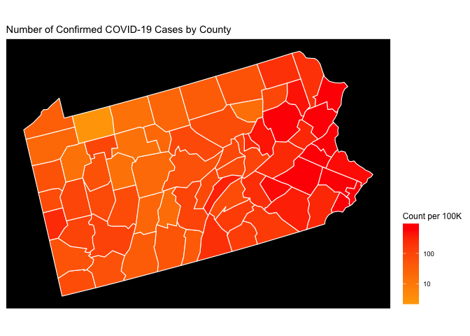
State Level Choropleth Maps
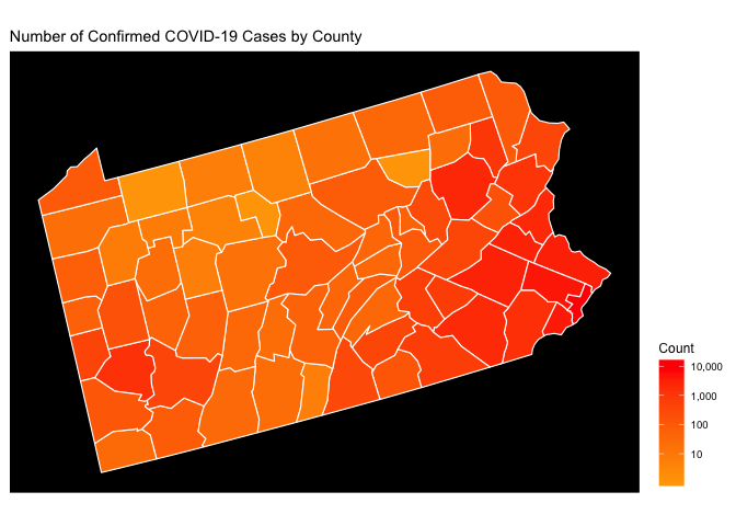
Now we’ll use the raw count choropleth at the state level. The usmap
library makes this easy with only slight changes to the code we
presented above. Given that I’m currently residing in Pittsburgh, let’s
take a look a Pennsylvania.
plot_usmap(data = df, values = "count", color = 'white', include = c('PA')) +
  scale_fill_continuous(
    low = "orange", high = "red", name = "Count", trans = "log", breaks = my_breaks,label = scales::comma) +
  theme(legend.position = "right",panel.background = element_rect(fill = "black",
                                                                  colour = "black",
                                                                  size = 0.5, linetype = "solid")) +
  ggtitle('Number of Confirmed COVID-19 Cases by County')
Now let’s take a look at PA normalized by population (counts per 100K) using the logarithmic density scale introduced above. Now we get to see some adjustment of the map when we normalize it by the county population.
plot_usmap(data = df, values = "count_per_100K", color = 'white', include = c('PA')) +
  scale_fill_continuous(
    low = "orange", high = "red", name = "Count per 100K", trans = "log", breaks = my_breaks,label = scales::comma) +
  theme(legend.position = "right",panel.background = element_rect(fill = "black",
                                                                  colour = "black",
                                                                  size = 0.5, linetype = "solid")) +
  ggtitle('Number of Confirmed COVID-19 Cases by County')
Regional Level Choropleth Map
And if we want to see a region, we just add a few more states to the
include vector:
plot_usmap(data = df, values = "count_per_100K", color = 'white', include = c('PA', 'NY','NJ')) +
  scale_fill_continuous(
    low = "orange", high = "red", name = "Count per 100K", trans = "log", breaks = my_breaks,label = scales::comma) +
  theme(legend.position = "right",panel.background = element_rect(fill = "black",
                                                                  colour = "black",
                                                                  size = 0.5, linetype = "solid")) +
  ggtitle('Number of Confirmed COVID-19 Cases by County')

Choropleths can be a powerful method of visualizing the spatial distribution of an underlying event or phenomena. In this case we used them to view and understand the spatial nature of COVID-19 cases in the United States. The power of interactive plots like the one used by Ian Kloo at https://iankloo.github.io/cov_map/ is that they can simultaneously model the spatial and the temporal density of data.